Lunchbucket Creative
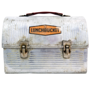
Visit This Site >>Colton Herta is an aspiring Indy and IMSA race car driver. He is a second generation driver, and the youngest winning INDYCAR driver after his victory at the Circuit of the Americas in 2019.
In collaboration with Lunchbucket Creative, I designed a site that reflected Colton's abundant skills, team partners, upcoming racing schedules and statistics, media, and swag.
Being mechanically minded, building this site was a real treat for me. The stories and imagery are already very compelling. It was great to see it all told in a way that lets his fans and other professionals get a comprehensive look at his career.
Lunchbucket Creative
Visit This Site >>Lunchbucket Creative is a brand design firm. I've worked with them on several projects and have always been impressed with their work. When they asked me to redesign their website (they also do website design), it was a real honor to have them ask me to do it.
Their old site was built on older technologies, and they're typically so busy that keeping up their own site simply took a back seat to ongoing business. Being a branding company, they had plenty of great imagery and copy to work with.
The new site cleanly represents their work in various categories, allowing prospective clients to easily browse work that is of interest, all while keeping their edgy brand.
Southland Rubber USA
Visit This Site >>Southland Rubber is a large industrial supplier of latex. They supply almost a quarter of the world's natural rubber. They've only recently started to sell their products in the North American market.
The old site was based on the Wix platform. They had made several attmepts to get a US website up and running, but kept running into issues simply getting the project done. They wanted a design that portrayed the environmentally concious methods, while also communicating their prowess at managing supply chains.
The site is uniquely different from their corporate mothership site, giving them their own identity, while keeping the messaging of the parent company.
Academy District 20 Public Schools
Visit This Site >>Academy District 20 is the largest public school district in the Colorado Springs area. They serve approximately 25,000 students in 40 schools. The district's old website used Microsoft Sharepoint as the backbone of their websites. The old philosophy was to deploy the tool to all their various departments, expecting them to create and manage all related content. What resulted was a jumble of over 1,500 pages containing outdated, redundant, and inaccurate information, which was unhelpful to parents and families trying to get information on policy, calendars, forms, and so on.
I worked daily with the web developers on the Commuciations Team for almost a year to develop the main district site, which served as a template for the almost 40 individual school sites to follow. The sites and the CMS are completely custom, are responsive, and are accessible to WCAG standards. Vue.js was used to produce data driven components that could be reused throughout the site. Nuxt was used to generate static html pages, decreasing load times and increasing security. Microsoft Azure services was used as our backend to store data, functions, and provide search fucntionality.
The result is a site that puts the visitors needs first. Families in a public school system are not on this site to browse. They have a specific tasks to accomplish, such as figuring out the enrollment process, finding an event, or a teacher's contact information. On the maintenance side, individual contributors are removed from the design aspects of the website, allowing editors to focus on content that is relevant and accurate.
The Rocky Mountain Highway Music Collaborative
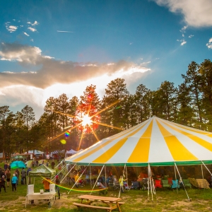
Visit This Site >>The Rocky Mountain Highway Music Collaborative is a non-profit organization dedicated to local, live music. These folks are responsible for the annual MeadowGrass Festival and are also deeply connected with the local music community. They provide skills workshops and career development for musicians along with venue opportunities and awareness. .
RMH's previous site was a multi-site WordPress setup. The Rocky Mountain Highway site and the MeadowGrass site were different, and the interconnection was not immediately obvious. Links between the two sites were un-intuitive and left the visitor wandering where to go for specific information.
The redesign is a single WordPress site which is focused on RMH philosophies, but the MeadowGrass festival has a prominent place and specific content pages. The ability to donate directly to RMH was added, along with new imagery and the ability to post news articles.
The D20 Foundation
Visit This Site >>The Academy District 20 Education Foundation is a non-profit organization providing scholarship and grant opportunites for students and teachers in the District 20 community.
The Foundation had several lackluster experiences with web design, from unfinished pages, to an abandoned domain. Content was stale and there was almost no functionality.
The redesign is a WordPress site to allow ease of transportability should they need a new developer. Content was scrubbed and new content was added. Visitors can now donate directly to the foundation, and students and teachers can download scholarship and grant information. Upcoming and past events are documented in a posting system which includes pictures and relevant links.
Blue Sun Enterprises
Visit This Site >>Blue Sun Enterprises is the home of a software developer who creates code for spacecraft flight operations. This project held keen interest for me as I have an avid interest in space exploration.
While there was previous content for this site, the objective here was to present it in a much more modern format and emphasize certain key technologies. The site is aimed at highly technical professionals with a background in space flight operations. In addition to the technical content, the imagery needed to portray not only previous flight experiences, but the promise of future missions.
As the owner continues to develop these technologies, it was prudent to think of future capabilites that users might want or need, such as online documentation for software and the ability to download software and other documentation.
Athena Capital Management
Athena Capital Management is a personal and institutional investment website. The owner has been in business for a number of years, and the original pages were constructed using older technologies and had some odd add-ins, such as a stand alone WordPress blog.
The first task was simply to recreate existing content in a new WordPress site. Existing financial articles and quarterly reports that existed as PDF files were converted into a blog so that the content was readily accessible and searchable. The new visuals and layout sparked a number of ideas regarding imagery, content, and structure. Most of the imagery on this site is custom. Basic elements were combined over multiple images to deliver a high-tech feel and add consistency from page to page.
Also of importance to the client, was the introduction of some basic SEO tactics.
George Bodde Fine Art
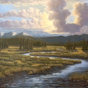
Visit This Site >>A good friend recently retired from his career to pursue two life-long passions, fishing and painting. He decided to make a business out of being an artist, and asked that I help him set up a site though which he could market and sell his paintings. Some of his works are located in galleries, so it was important to develop a way to show all of his works, while respecting the sales pathway for those pieces in a gallery. The solution here allows the customer to browse all of George's work, and directs them appropriately when a piece is not available online.
Squarespace was a good choice for George. He had already created an initial site just to show off his work, so he was already familiar with the interface. Additionally, it's likely he'll be performing the site upkeep in the future, so keeping him on a familiar platform was important. He also wanted a more professional look and eCommerce functionality.
Because Squarespace is template driven, the designer is constrained by the elements offered in the template, significantly limiting customization. That said, the templates offered by Squarespace are well thought-out and executed, making most of their sites professional looking and consistent in performance. While I prefer the flexibility of a custom built site, Squarespace is extraordinarily easy to use, and is not as quirky to set up and use as WordPress.
Bluebird Metals
Bluebird Metals is a startup jewelry eCommerce site. The owner designs and markets jewelry used primarily as a reminder of lost loved ones. A significant portion of the product proceeds goes to a non-profit organization that helps those going through grief and loss.
The owner had some existing assets at inception, such as the domain and a hosting service already setup. WordPress seemed like the ideal choice as the client wanted to be able to easily maintain the site after design and launch were completed, and also wanted an easy way of taking multiple payment options that could be linked to shipping assistance.
I am a strong proponent of ideation through iteration. The owner and I would regularly prototype various layouts and imagery allowing the iteration process to drive us to a site design that was clean, functional, and met her desires for showcasing the product.
WordPress is amazingly powerful. There are a myriad of templates and plugins to give virtually any functionality the designer might need. There are a few caveats, though. The sheer number of templates and plug-ins is daunting, and finding the right one that is also high quality can sometimes be a challenge.
perryswanson.com
Visit This Site >>After completing my website, I felt like I needed to do something else to really make my new knowledge sink in. This is my partner's webpage. For me, this was more an exercise in testing my design chops. I wanted to see if I could put what was in my head on the screen. It's a bit unconventional, but this is probably the creative work I am most proud of to date.
Nascent-Designs
HTML, CSS, JS, PHP, SQL. So many acronyms. The web is built on these languages. Understanding how they work and interact with one another is crucial to building sites with efficiency and with the right functionality.
This web site is built entirely "by hand" using only a text editor. It's built upon the same structure as my personal website, paulhollendorfer.com. The pages here are driven from a home-grown CMS (Content Management System) using PHP and SQL. On the back-end (server side) there is a database which contains all of the subject and page descriptions, as well as the page content itself. There are a set of administration pages that allow the user to create, edit, and delete any of the subjects, pages, or administrative users. Subjects and Pages can be made visible (or not), and their order can be specified. Management of the comment system and a utility for uploading content to the site are also included.
On the front-end (client side) the menu structure is built on the fly by querying the database for subject and page information. When a particular link is clicked, another query is made to get the page content, which is loaded into a common framework page.


